
Tuesday, February 26, 2008
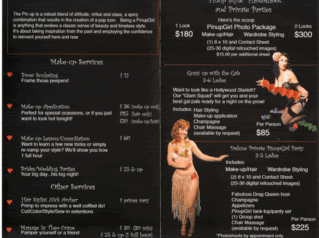
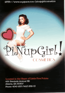
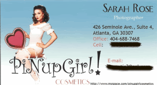
new business card
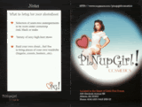
My Invitation

This is my invitation I created for the makeover parties they provide! the circles on the tops will be holes for the ribbon. This will be printed on vellum and fabric will be backing it
Friday, February 22, 2008
possible web sites
ok so far ive checked and they are available!
www.pinupcosmetic.com
www.pinupatl.com
www.pinupgirlcosmeticsatl.com
www.L5Ppinupgirl.com
www.pinupcosmetic.com
www.pinupatl.com
www.pinupgirlcosmeticsatl.com
www.L5Ppinupgirl.com
ok im going in another direction....


OK so i think i want to make the text a little more distressed on the front of the card. to match its look and the back i like that it is lighter because it looks more secondary... and for some reason its a little bit more muddy than what it really looks like.. imagine the top one.. just purple

Thursday, February 21, 2008
Monday, February 18, 2008

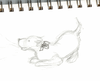
Sunday, February 17, 2008
ok my painted dog w/o its bow

depending on what color im going for with the cards is what im going for with the color of the dogs bow
green or yellow?
 i cant decide which color i like better. think of it as the whole side of the business card and i will carry that color throughout other accent ideas.


Friday, February 15, 2008
im starting a new....
i decided i just cant feel my logo, and dont like it because its too similar to something i did last semester. SOOOOOOO im changing it up. i think i still will ride the tea party wave but begin another logo as well for another company. i want to do decorative and funky... since i dont have that in my portfolio. So a journey begins!
Thursday, February 14, 2008

Wednesday, February 13, 2008


Tuesday, February 12, 2008
1,2,3 or 4
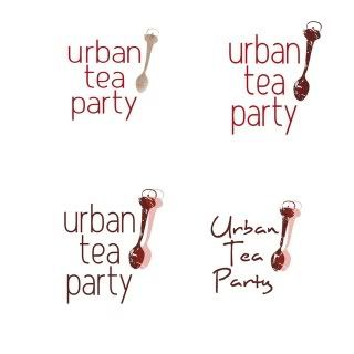
clockwise from the top left.... I really like the texture the stencil created and it reminds me of the blue or red pots with the white speckles in it... I think im also leaning more towards the more structured font.. but I altered it in number 1 i do like that more condensed look. i feel i can do more with it. As far as the other three go i really do like how the spoon looks on them but i think i might just go with 1 or 2, so without the 2nd spoon in the mix.
Friday, February 8, 2008


more logo

I think this is more the direction I am going to go in... i just like the spoon so much and dont want to over do it. the texture on the spoon is not going to look like that, i want to try a potato print. so the texture here is just to see the distressed next to the text. also the text im not too sure about.. not sure if i should go nature-ish since tea = nature. or go with a san serif... and straight letter..
Tuesday, February 5, 2008

Monday, February 4, 2008

Sunday, February 3, 2008
whatcha think?

OK need suggestions. Serif? Sanserif? What direction looks the best?
I still like the origional straight up and down with the pot facing to the left. but am lost on the typeface, open for suggestions

Subscribe to:
Posts (Atom)
