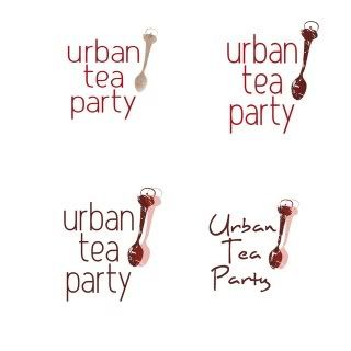
clockwise from the top left.... I really like the texture the stencil created and it reminds me of the blue or red pots with the white speckles in it... I think im also leaning more towards the more structured font.. but I altered it in number 1 i do like that more condensed look. i feel i can do more with it. As far as the other three go i really do like how the spoon looks on them but i think i might just go with 1 or 2, so without the 2nd spoon in the mix.


1 comment:
wow is kind of difficult... there awesome but the first one is saying "home" and a "warm feeling" I also think that the handwriting type takes away from the great structure of the spoon. great job, sooo jealous =)
Post a Comment